The Motivation Behind WeWork's Innovative Office Design


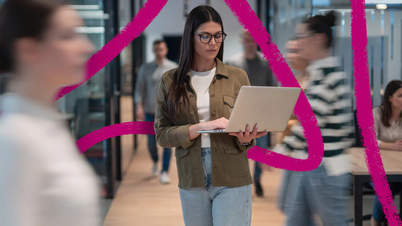
Over the past few years, no organization has been able to experiment more with space and office design than WeWork. The company currently boasts more than 40,000 members who have access to its 67 co-working office spaces scattered across the globe. Each WeWork office is painstakingly engineered to foster a mix of comfort, community, and productivity.
Meet Devin Vermeulen, WeWork's Creative Director
Devin Vermeulen, WeWork’s creative director of physical product, has been thinking about how to maximize and disrupt office space for a number of years now. Having received an architecture degree from the University of Kansas, Vermeulen worked for architecture firms in New York before going in-house at retail boutique chain Brooklyn Industries.That was until Miguel McKelvey, WeWork’s chief creative officer, reached out to see if he wanted to help with a project in need of some architecture and design input.
At the time, WeWork was in its first space — two floors in a building in Soho. Vermeulen became its fourth employee, helping the company — along with McKelvey — set the design aesthetics in its early days and building out WeWork’s interior design brand.We recently caught up with Vermeulen to find out what informs WeWork's office design strategy, and how it has evolved as the company has grown.
What was some of the thinking that went into the design decisions in the early days?
Miguel and I both just started with the premise that offices suck. We had barely ever enjoyed being in any office I had ever worked in, and we were wondering how do we start over, to some degree.That thinking was probably sort of brash, but it was a good way to begin.Especially in those early days, co-working was a new concept to most people; even explaining to people what WeWork was generally took me about 10 minutes. We realized that what we would be competing with for a lot of potential members was their home. We were asking people to spend money on space, to come in, rent space from us, and be a member. A lot of those people weren’t spending any money at all if they’re working at a coffee shops or at home.
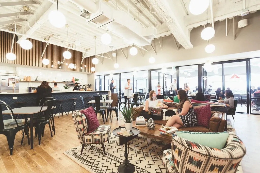
We knew people would get a lot out of coming and being part of this community; we knew community was a big part of what we had to create.Work/Life balance has been shifting over the decades, and with the advent of smartphones, your work life has invaded your home life. People are working long hours, answering emails at home, and in order to balance that we wanted to bring a lot more of home into the workplace.We wanted to create space with that same level of comfort that you get out of your living room, a place where you can kick your feet up on the sofa, and feel comfortable. We wanted WeWork to be a place where members aren’t constantly looking at their watches, trying to think about when they’ll be getting out of there. We wanted them thinking that the space was pretty great, give them the same feeling of comfort they would get at home, as well as the same lack of anxiety and the same creativity they could have at home.

As you have evolved you're thinking on space and design, what are some things you have learned and applied? How has trial and error informed WeWork’s office design?
Especially in the early days, it was great because we were really small. We were moving from building to building, and I had probably 15 different desks over the first couple years that the company existed. Every new building that we designed, we would go there and work out of it, and it was great because we could learn and tweak everything.We’d be at a space, and we would decide that we didn’t like a print corner, or that something wasn’t in the right space. Sp we'd figure out a design solution for it, and in the next building we’d implement the change. We’d move there and work with it and see if we liked it or not and if we did we’d keep replicating it, and if we didn't we’d fix it and try again.And that was with everything, from the meeting rooms to the heights of the whiteboards, the lights and the TVs. There were a million little tweaks that we made. And every time, we would try to catalog it so now we have a wiki of all those things. The knowledge base we built we then distributed to all the teams.That's evolved into a larger scale data collection effort.
Take, for example, what we do with our conference rooms. We have our members rate the room and at the end of their booking, just like they would an Uber ride. If it scored low, the design team would go to that room and try to figure out what people don't like about it, learn from it, and extrapolate from there. And vice versa. If everyone loves one room, we will go in and try to figure out what's so great about it, why it's so different. We’d then capture that and try to replicate it in future rooms. There's a lot of concerted data collection and analysis going on as we scale up.
In terms of innovating, if there was no solution to an office or design problem you're trying to solve, how did you figure one out on your own?
Because we are so focused on community, a lot of what we did involved watching how people interact with the spaces, and then trying to figure out how to encourage more communication and how to coach people to start chatting with each other.So we ended up designing these amenity bases. We would put the printers and the food in one area so that everyone is always moving in and out of that space. When you go to pick up a print or grab a coffee, you are always running into other people, and there's this opportunity for you to stop and chat in a natural way. That’s how we ended up connecting people and helping create a community, instead of just a bunch of people who just happened to work in the same space together who never interact.
How do common office design practices impact what you do with WeWork?
It's funny. I was recently at a conference with one of the original designers of the cubicle and he was talking about how essentially before the advent of the cubicle, offices were big open rooms with a bunch of desks in them. Everyone complained that they didn't have personal space and that it was too noisy to get work done. They thought the cubicle was an amazing solution to those issues.And here we are now, where we are all going to this open office format and we view the cubicle in a poor light. Basically we are going back to the way it was before the cubicle was created. And the inventor, who spoke at that conference was telling everyone that they were crazy, that we are just repeating the same mistakes made generations ago.I took that to heart.
What we do is create what I call energy zones. The shared space is obviously the loudest; there is music playing, people are getting coffee, and its got an energy that is infectious and that you want to be part of. But then you've got your desk space, offices, and conference rooms that have a different energy, they are quieter, and it's easier to get work done, but there are still people around. Then we have nooks and the phone booths that are quiet and space you can go if you really need to get things done.Throughout your day, depending on what you need, you have a place to go. It is not static. You can move through the space and the different energy zones to get what you need.
What is the favorite feature that you have designed at WeWork, what are you most proud of?
That's a good question. I think it might the the staircase here at WeWork HQ (pictured above).We moved into this space in August, and we knew we were getting to the size, with over 400 people at our headquarters, that we were going to have to split between two floors. So, we wanted to connect it with a staircase because we knew that if people had to use the building staircase or the elevator it would feel very disconnected.
We wanted the staircase to feel as if it was a natural flow from one space to the next, to be open so that it made it feel as if we were all on one big floor. So instead of having just a staircase, I had this idea of creating "lily pads" as I called them — three big platforms that are interconnected with smaller stairs that each have their own meeting space on them. There are a lot of plants around it, the whole thing is surrounded by greenery. It has sort of become a vertical garden in the middle of the space, which makes it more alive all day.It goes a long way to making us feel more connected even though we are split up.Looking for office design tips?
Check out our guide here.