Interactive Maps, Big Screen Schedules, and Hidden Office Corners


When the organization was small, it was easy. Everyone could see the entire office from their desks. Most people had the same shared schedule. Finding a free room or person took a glance down the hall. But success comes with a cost, and as the system grows, it becomes overwhelming.At Robin, we believe crisp visuals with clear access is the key to unlocking both the mysteries of an office — and ways to improve. Today we're sharing the first round of beautiful new visualizations to help organizations bring back clarity to your work day.Some parts (like Maps) are available starting today, with the rest rolling out over the next couple months.
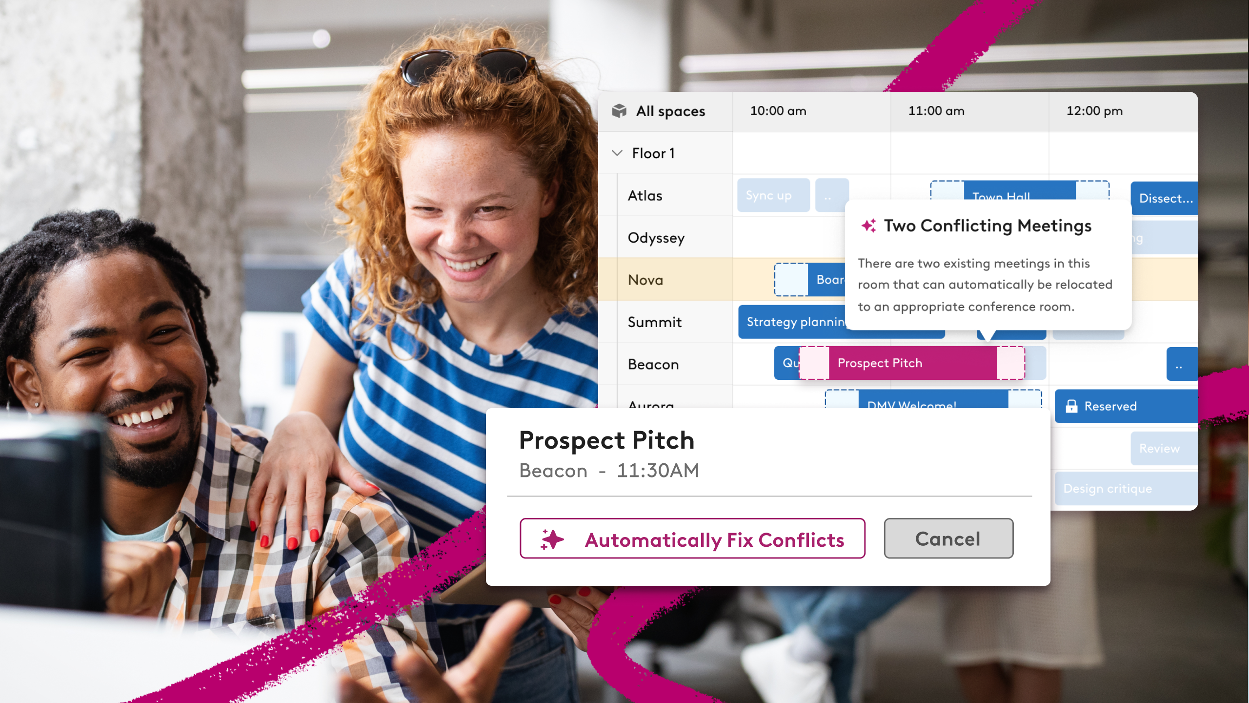
Interactive Maps
Last year we added basic support for map uploads. It was the first time many folks saw their workspace from the same view as their facilities team. One grand expedition even discovered a “closet” they walked by daily was actually a fully functioning call room.We'd like to encourage more of these discoveries.
A new way to find the right space

Robin Maps lives between facilities blueprints and a crumpled paper pinned in the break room. There’s room for mapping outside traditional IWMS systems and indoor wayfinding directions. If that sentence read like nonsense, you’re exactly the type of person we designed Maps to help.


How to get started with Maps
We’re launching Maps as an optional add-on for Scheduling and Desk customers. This is a first for Robin, and we intend to get it right. We had lively debates internally during development — why not just make this a feature and include it with all of today’s scheduling customers?
This approach is important since it allows us to dedicate a team to making Maps an essential office tool you’ll love using. As an add-on we’ll be able to make the map experience a first class citizen with ongoing feature development. This includes layers for Insights, Desks, and a few yet-unannounced office integrations launching in the coming months.

Maps is available today. Every single map submitted gets the same design treatment to make sure it’s the best possible starting point for wherever you use Robin today. Send us your maps, doodles, or abstract representation of “the office” to kick off the process.
Put your office on the big screen
Status Board is a new way to show “right now” availability for larger parts of your office. It’s great signage for large format displays like TV’s, and brings live updates to places your team already works. It’s designed for flexibility, across a handful of visualization modes.The first mode we’re releasing is for scheduling. Other modes for maps and desks visualizations will roll out over the next few months. It’s easy to get up and running, with shareable links you can open anywhere — no login required.

The first scheduling mode for Status Board is available for a small group of customers today, with full rollout planned by end of month.
More Insights metrics and tips
Today’s office overview forces you to bounce between a few pages for a complete picture:

This Spring you’ll have better bundling of key metrics through a redesigned reporting for analytics. The first stage improves how we group similar metrics for easier discovery:

Through our Insights team, every month we learn more about how people move around the office. More importantly, we’re able to highlight how to keep things running smoothly. This data improves recommendations and search results behind the scenes. It also shows up in the charts and reporting tools available in the web dashboard today.You’ll see this thinking with goal driven themes like “Facilities” and "Focus" on top of usage metrics. These reports are a combination of many new metrics we’re sharing for the first time, and clearer answers to “What needs my attention this week?” for office admins.
What about the rest of us?
Admins aren’t the only people in an office, of course. You’ll also see new ways to help individuals find the best time and place to get work done — even if that’s just you, a quiet corner of the office, and the brave new frontier of a blank spreadsheet.

This is a preview, and we’ll have more to share in the coming weeks.